Design status at departure
Version 8 complete — desktop and mobile components fully integrated, responsive behavior defined at the system level, and 100+ products shipping inside a unified shell.
Rebrand speed
The component architecture let a company-wide visual rebrand roll out across the product suite significantly faster than would otherwise have been possible. Because every product drew from the same components, the rebrand could be planned as a single structured inventory — more than 200 applications and configuration screens spanning desktop, mobile, and universal platforms across 15 functional areas — each item mapped to an owner, a size estimate, and a delivery order, rather than re-themed product by product.
Accessibility
Improvements were made within the constraints the organization would support — a color audit for color-blind friendliness, data-visualization contrast verification, and distinct iconography for status notifications so state was never communicated by color alone. No dedicated resourcing; opportunistic gains.
On the mobile push. I made the case for mobile parity earlier than the business was ready to commit to it, and couldn't make the argument stick on its own. The iPad collision is what made it unavoidable — clients on large-screen tablets getting phone layouts, with no good answer for why. Version 8 exists because that collision validated what I'd been advocating for. The right read isn't that I failed to persuade. The right read is that I diagnosed the problem before the business felt it, built the case over time, and delivered when the case became impossible to defer. That's a longer arc than I wanted, but it landed.
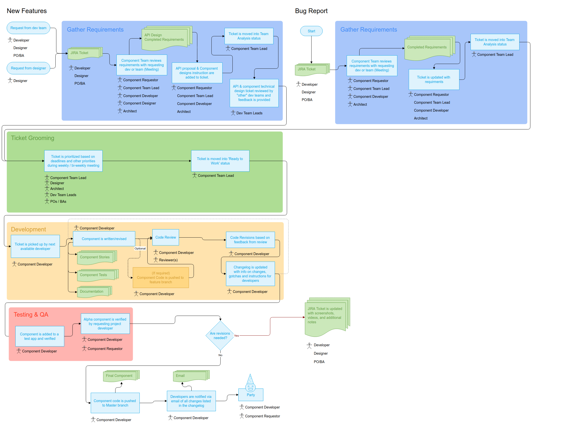
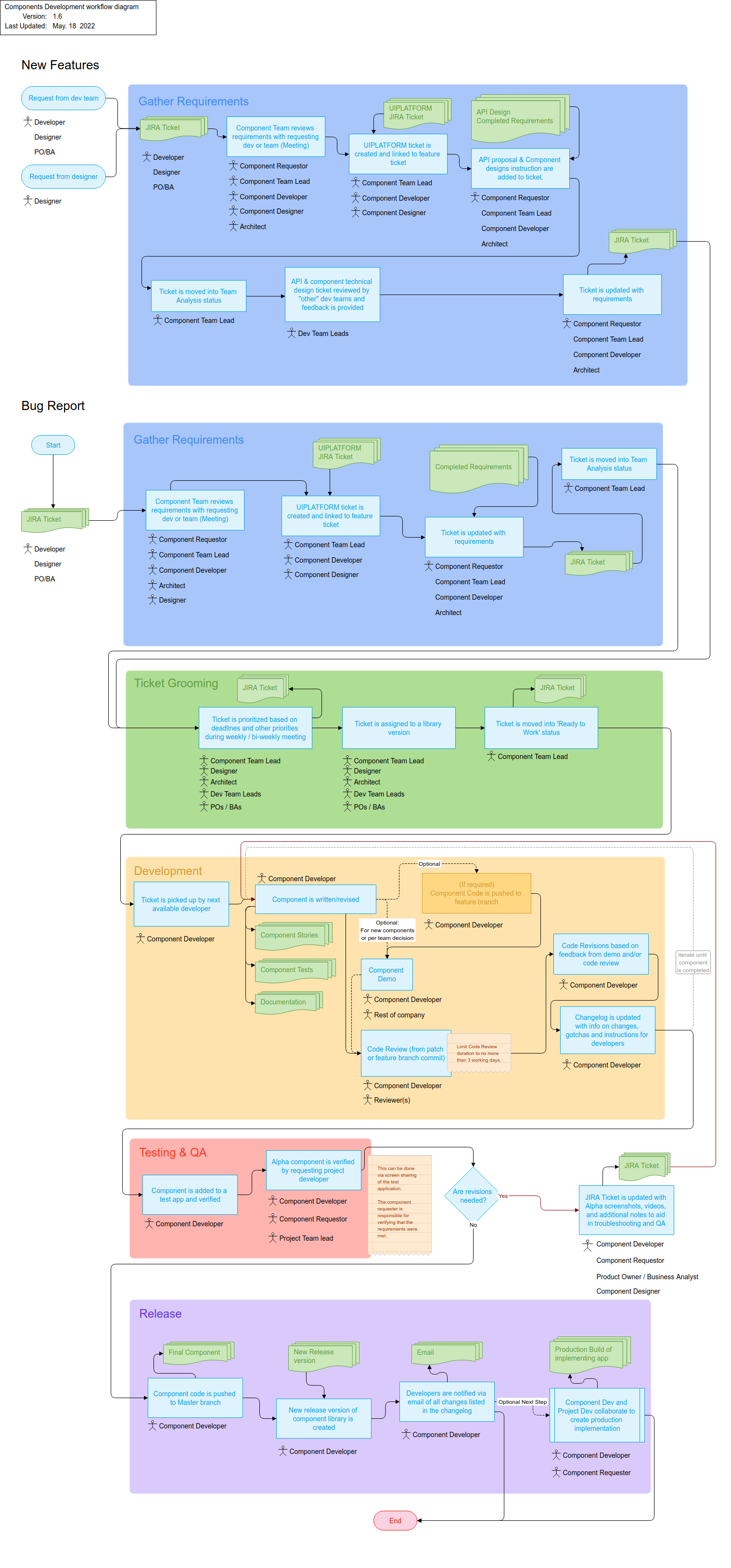
On the overrule path. The escalation route — VP of Development or CTO overrules under schedule pressure — was the right structural answer for an organization shipping at pace. It also occasionally moved components ahead of design readiness, with UX debt in lower-priority areas as the cost. The governance model worked best when design and engineering timelines were aligned; where they weren't, schedule won. I'd build the same model again, but I'd be more explicit up front about where the debt accumulates so it stays visible rather than absorbed.