Case Study
Cash Disappeared.
So Did the Tips.
Hotel guests stopped carrying cash. Housekeeping staff stopped getting tipped. The result was a retention crisis — and an opportunity to solve it.

Case Study
Hotel guests stopped carrying cash. Housekeeping staff stopped getting tipped. The result was a retention crisis — and an opportunity to solve it.
The shift to cashless payments cut off tip income for hotel housekeeping staff, creating retention pressure for hotel operators in an already constrained labor market.
Solo designer — led experience strategy and execution from discovery through launch, including research, feature scope, engineering partnership, and post-launch analytics framework.
No app download or account creation. Payment processing rules required taxes and fees to be charged on top of the guest's selected tip amount — not absorbed into it. Individual employee attribution wasn't operationally reliable.
Shipped as a web app extending our workforce management platform. Hotels could configure tipped departments, route payments within existing workflows, and offer guests a frictionless mobile tipping experience.
As hotel operations rebounded after COVID, operators faced a retention problem that wasn't immediately visible. Guest payment behavior had shifted almost entirely to cashless — but tip-dependent roles like housekeeping hadn't seen a corresponding change in compensation expectations. Guests wanted to tip but had no mechanism to do so.
For our clients, this created staffing pressure. For our platform, it was an opportunity to extend our workforce management product into a capability that directly addressed a client pain point — without requiring hotels to adopt a separate tool.

The app supported common mobile payment methods, such as Apple Pay and Google Pay — meeting guests where they already were without requiring new accounts or app downloads.
In January 2022 I ran a guest tipping-behaviors survey with a recruited pool of business and leisure travelers — 52 responses — followed by a small round of usability testing on the early wireframes. The recruitment leaned on UniFocus colleagues who travelled regularly for work, plus friends and friends-of-friends who travelled for leisure.
The headline question was whether a cashless tipping option was actually wanted. It was — overwhelmingly.
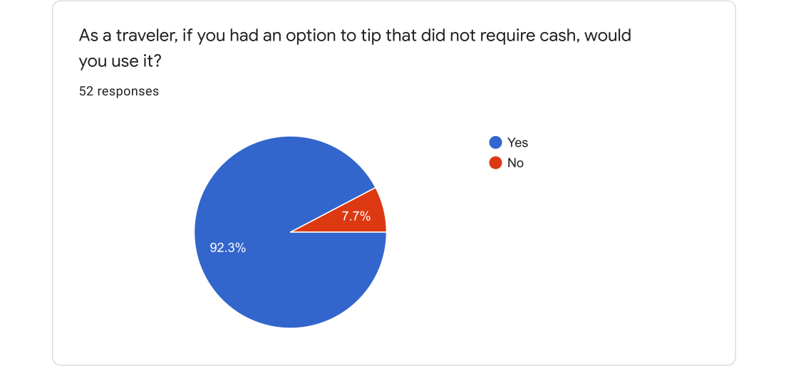
52 responses. 92.3% would use a cashless tipping option if it were available.
The four "No" respondents were sharper than the headline. Their objections weren't about cashless payments in the abstract — they were about trust in attribution. Those open-ended responses ended up shaping the entire design.
"Suspicion that a non cash tip is not going to reach the person I tipped."
Survey respondent — "No" answer
"In my experiences working as a Valet Credit Card tips are often tip pooled while cash tips are not. I have no interest in tipping their manager."
Survey respondent — "No" answer
"Because tipping should be more personal and credit seems more like just paying people what they should be paid to begin with."
Survey respondent — "No" answer
Two more findings reframed the design problem from "build a tipping app" to "build a single end-of-stay moment." Most respondents who tip housekeeping do so only at check-out, not each visit — and a majority don't use daily housekeeping at all on multi-day stays.
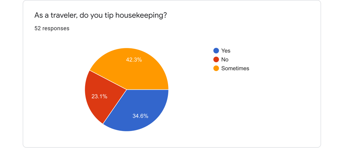
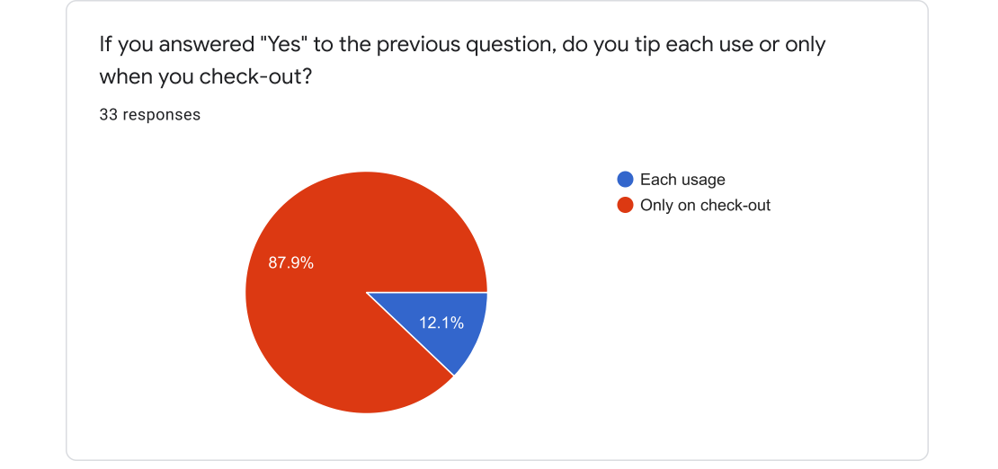
Baseline behavior (left): 34.6% tip housekeeping, 42.3% sometimes, 23.1% never. Tipping cadence (right): of those who tip, 87.9% do so only at check-out. The design problem became optimizing one end-of-stay moment, not a recurring multi-touch flow.
The amount-entry pattern was the other design-shaping finding. Guests overwhelmingly think in fixed dollar amounts, not percentages — which ruled out a "% of bill" UI and pointed straight at preset dollar chips with a custom-amount escape hatch.
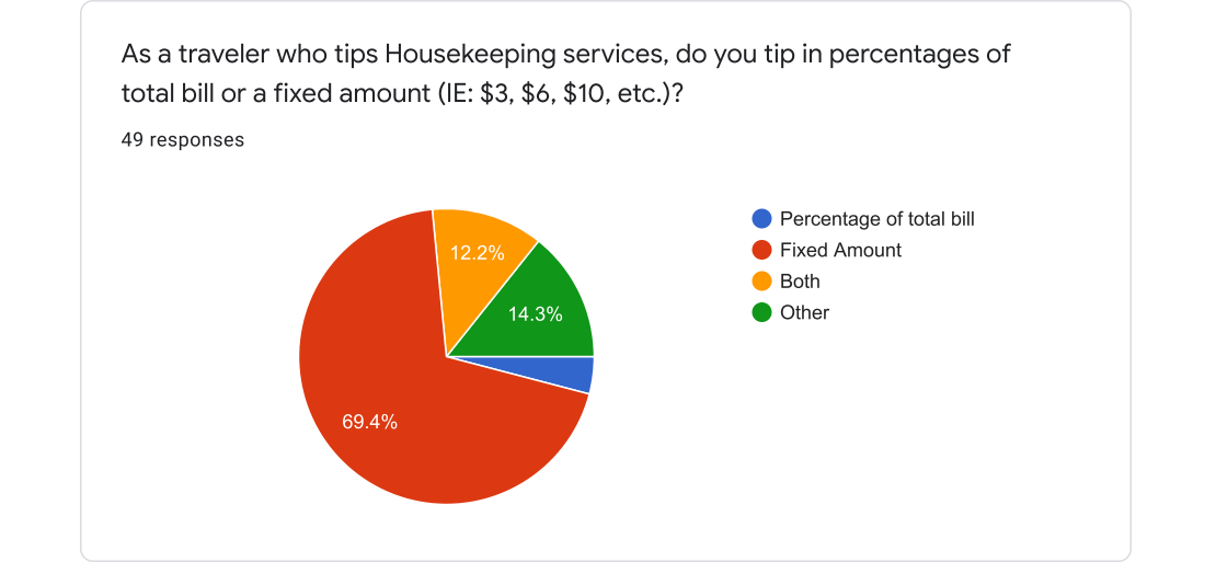
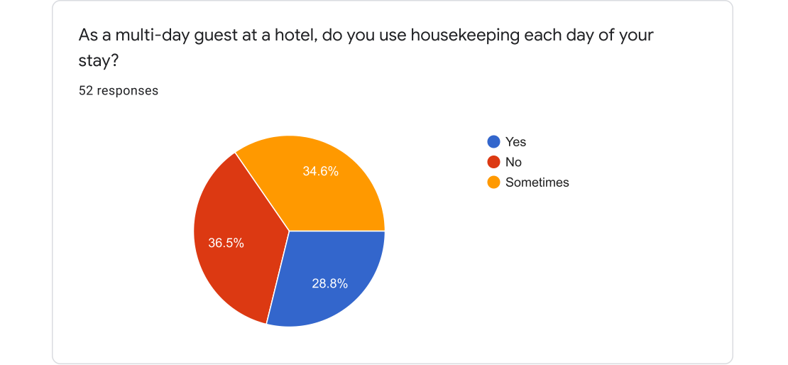
Tip-amount habit (left): 69.4% fixed dollar amount; the "other" responses were dollar amounts too. Multi-day housekeeping usage (right): split roughly in thirds. Together these said the flow had to default to fixed presets and not assume a daily tipping cadence.
What I took into the design:
I started on paper. The earliest flows explored two parallel concepts — a QR code placed in each guest room that routed tips to the property and department, and an employee-handed tip card that tied the tip to a specific staff member. The room-QR model won because it didn't depend on operationally fragile attribution to a single person, and because it kept the cognitive load on the guest as low as possible: scan, pick an amount, pay.
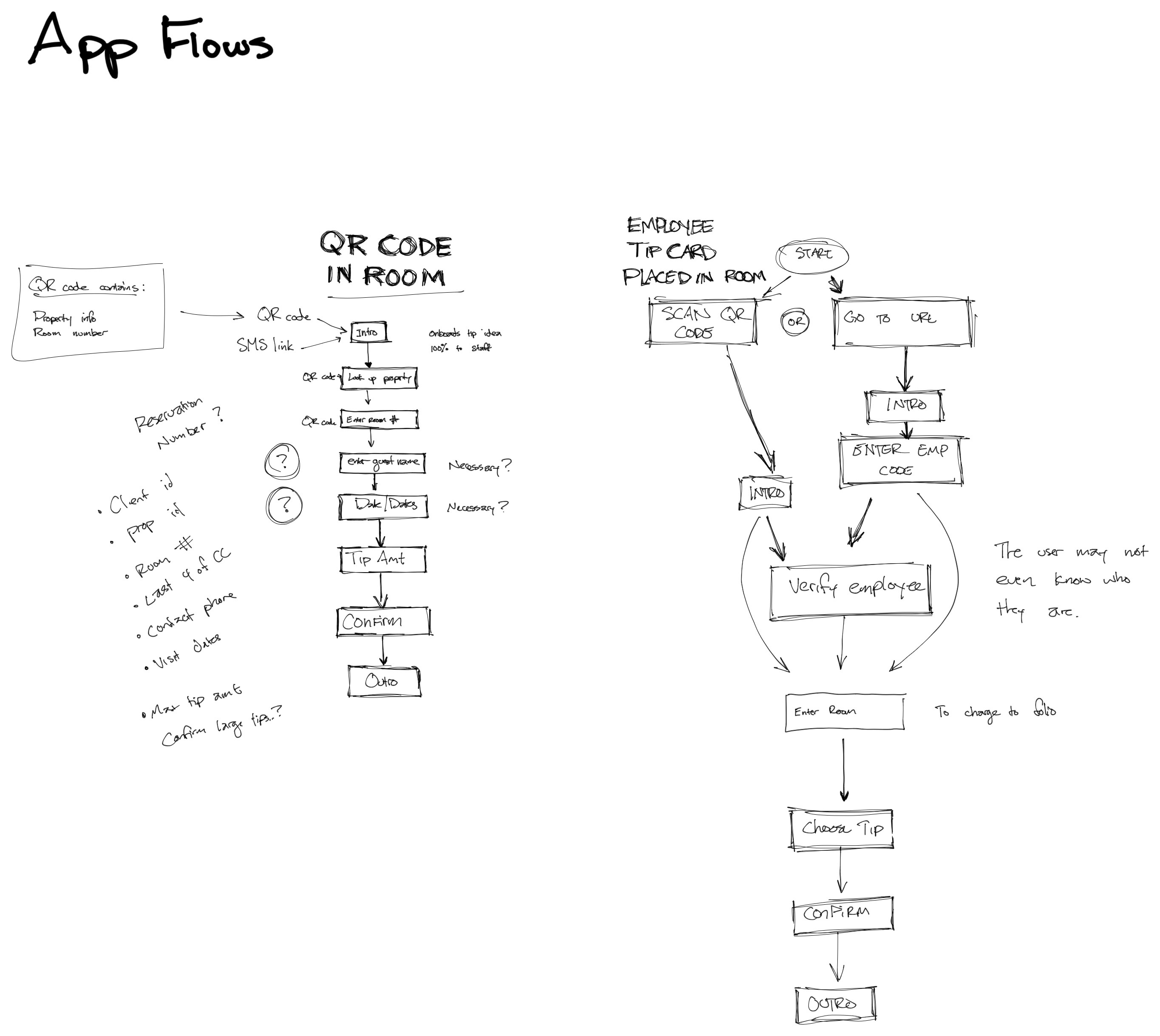
Two early concepts I explored on paper: a QR code placed in the guest room versus an employee-handed tip card. The room-QR concept won because it removed individual-attribution risk and shortened the path to payment.
Before committing to a structure, I sketched the two layout options that would shape everything downstream: a multi-step paginated flow with breadcrumbs, and a single-screen scrolling layout that put recipient, amount, and disclosure on one surface.
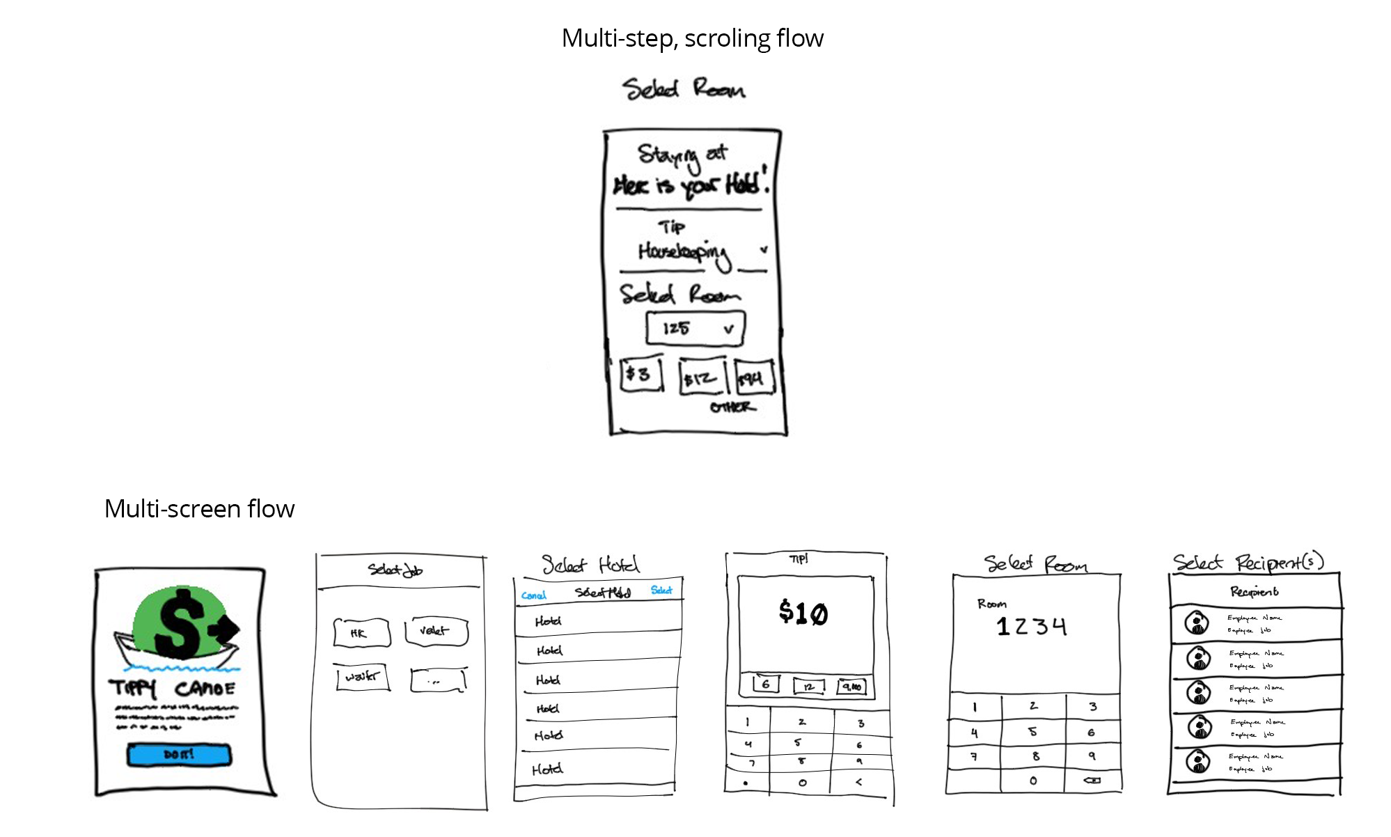
I sketched both structural options before committing — paginated multi-screen versus single-screen scrolling. Each implied a different relationship between the guest's intent and the number of taps required to express it.
I built the paginated version first because it felt safer — each step did one thing, with breadcrumbs to mark progress. Testing it changed my mind. Five screens with forward/back navigation felt like a checkout flow, not a tip. Bounce rate was the metric that mattered, and every additional transition was a chance for the guest to abandon the action.
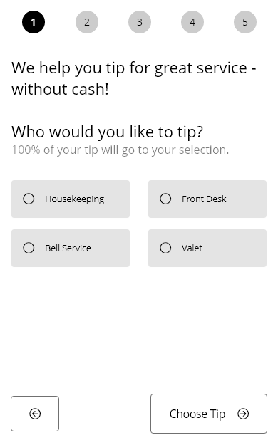
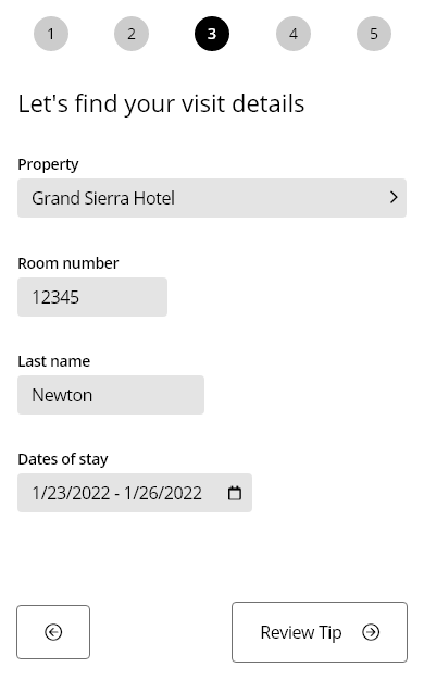
The early v00 wireframes: a five-step page-based flow with breadcrumbs at the top. Each individual screen was clean — but together they added up to too many taps for an in-the-moment action.
The revised design eschewed the page-based approach entirely. Recipient selection, tip amount, and disclosure collapsed onto a single scrolling surface, cutting three transitions out of the flow. The intro became a branded loading-state interstitial so guests could recognize the property before being moved into the tip itself, and hotel-set quick-tip presets anchored expectations — testing consistently produced higher tip amounts when the presets were present than when guests faced a blank custom field.
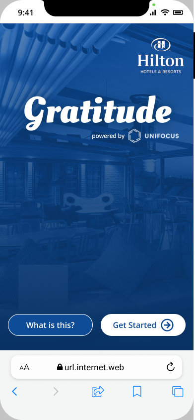
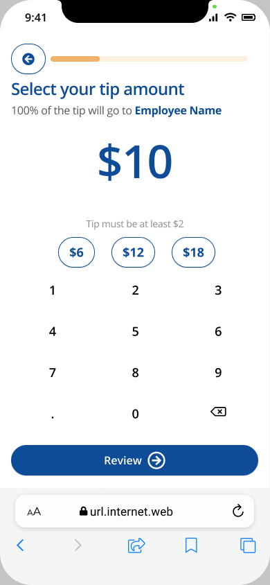
The refined v1 design. Left: a branded splash that doubled as a loading-state interstitial — guests saw the property they were tipping at before they were dropped into the flow. Right: a single-screen Choose Tip view with progress bar, large readout, three presets bracketing a target, and a numeric pad for custom entry.
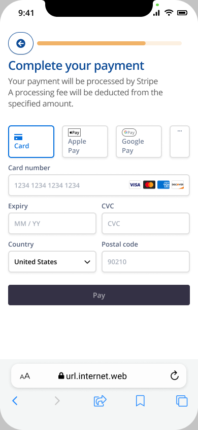
Payment was handed off to Stripe-native components. We inherited their security review, fraud handling, and PCI scope rather than building any of it ourselves — which let me keep design effort focused on the guest-facing moments where trust was actually being built or broken.
As the sole designer, I owned the experience end-to-end — from research and feature scope through engineering partnership and launch. I defined the feature scope in collaboration with Product, shaped implementation decisions with Engineering, and contributed to the rollout strategy across hotel properties.
I also established an analytics framework post-launch to track adoption, completion rates, and tip distribution — giving the business a way to measure impact over time rather than shipping and hoping.
The product shipped under its own brand, Gratitude, with a whitelabel system that let each hotel apply its own primary and secondary colors, splash image, and logo. Buttons inherited the primary color; headers and bold text inherited the secondary. I built a live preview into the admin so hotel operators could see their configuration before pushing it to guests, rather than discovering issues at the moment a guest tried to tip.

The product shipped under its own brand, Gratitude, with each hotel's primary and secondary colors applied through the whitelabel system.

Hotels appreciated the ability for guests to rate service staff. Service staff saw the app as a differentiator and a chance to let their work speak for itself in front of management.
Department-level attribution over individual
Research showed guests were more likely to tip when they trusted the money reached the right person. We explored associating tips with a specific employee's name and photo — but hotel operations couldn't reliably guarantee which individual serviced a given room. Misattribution would have eroded exactly the trust we were trying to build. We shifted to department-level routing with property configurability, which was operationally honest and still gave guests a clear sense of where their tip was going.
Transparent fee disclosure at payment, not upfront
Legal constraints required taxes and fees to be charged on top of the guest's selected tip amount — we couldn't absorb them. Surfacing this too early risked discouraging completion before the guest was committed. Hiding it until the summary screen risked a trust-breaking surprise. We disclosed at the payment step — after tip selection but before confirmation — to preserve trust without front-loading friction.
Three preset tip amounts to anchor the middle
Rather than an open amount field, we offered three preset options — deliberately chosen to bracket a target amount and make the middle option feel like the natural choice. The full screen was dedicated to tip entry to prevent mis-taps, and a large readout ensured guests could see exactly what they were selecting. Custom amounts stayed available but were bounded by hotel-configurable min and max — surfaced inline as the guest typed rather than as a blocking error after submit.
Help at the point of need, not on its own screen
A separate help screen would have added a transition and broken the focus of the tip flow. Instead, contextual "What is this?" affordances surfaced a drawer that explained tip pool routing inline — answering the question without forcing the guest off the path to payment. Help only appears when it's asked for, never as something to dismiss.
Added a rating layer to extend beyond payment
Research surfaced that guests wanted to recognize good service, not just complete a transaction. We added a lightweight department rating at the end of the flow — giving hotels a service-quality signal alongside financial reward, and giving guests a way to express appreciation that felt more personal than a dollar amount.
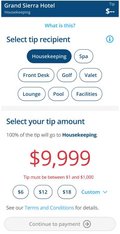
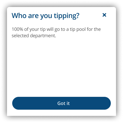
Left: a custom tip outside the hotel-configured bounds, surfaced inline rather than as a blocking error. Right: the help drawer used by the "What is this?" affordances — context-on-demand without leaving the tip flow.
Launch status
Shipped as a web app extension of the platform under its own brand, Gratitude. Feature scope, payment model, configurability, and rollout delivered as planned.
Post-launch measurement
Analytics framework implemented to track adoption, completion rates, and tip distribution over time.
The most interesting constraint was the one we couldn't design around — taxes and fees on top of the tip amount. We couldn't change the rule, so the design problem became purely about when and how to communicate it. Getting that timing right was the difference between a trust-building moment and a checkout abandonment.
← → prev/next · scroll or pinch to zoom · drag to pan · Esc to close